


Register for a Free Live Training
Hot Stocks Outlook uses VantagePoint’s market forecasts that are up to 87.4% accurate, demonstrating how traders can improve their timing and direction. In this week’s video, VantagePoint Software reviews forecasts for SPDR SPY($SPY), Blue Bird ($BLBD), Amgen ($AMGN), Palantir ($PLTR), Copart ($CPRT), Denali Therapuetics ($DNLI). Molson Coors Brewing Company ($TAP)
SPDR SPY ETF ($SPY)
VantagePoint A.I. Hot Stocks Outlook for April 25, 2025
Hello again, traders, and welcome back to the Hot Stocks Outlook for April 25th, 2025. I hope you all have had an excellent week out there in the financial markets, and as always, we’re here to take a look at the most recent VantagePoint A.I. predictive forecasts.
If you haven’t already, make sure you go ahead and click on the link down in the description below. You can get signed up for a live demonstration and learn all the specifics about how these predictive indicators and technologies are helping traders make much better trading decisions when out in the marketplace.
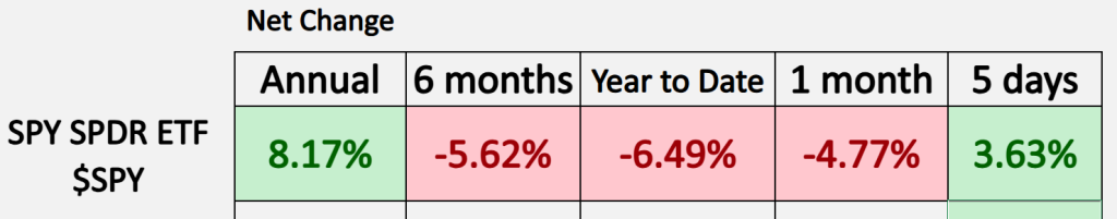
Now, as we typically start out in these Hot Stocks Outlooks, we take a look at the SPY ETF. We can see here year-to-date we are now down 6.5%. Now, when we look at these one-month and 5-day numbers—with the volatility that we’re seeing—the market moves that much in a day or two now. And we’re getting a lot of noise. This is why it’s especially important, if you’re trading individual stocks, to find those areas where there’s a very strong forecast and therefore a higher probability that you’re likely to see the expected type of move.
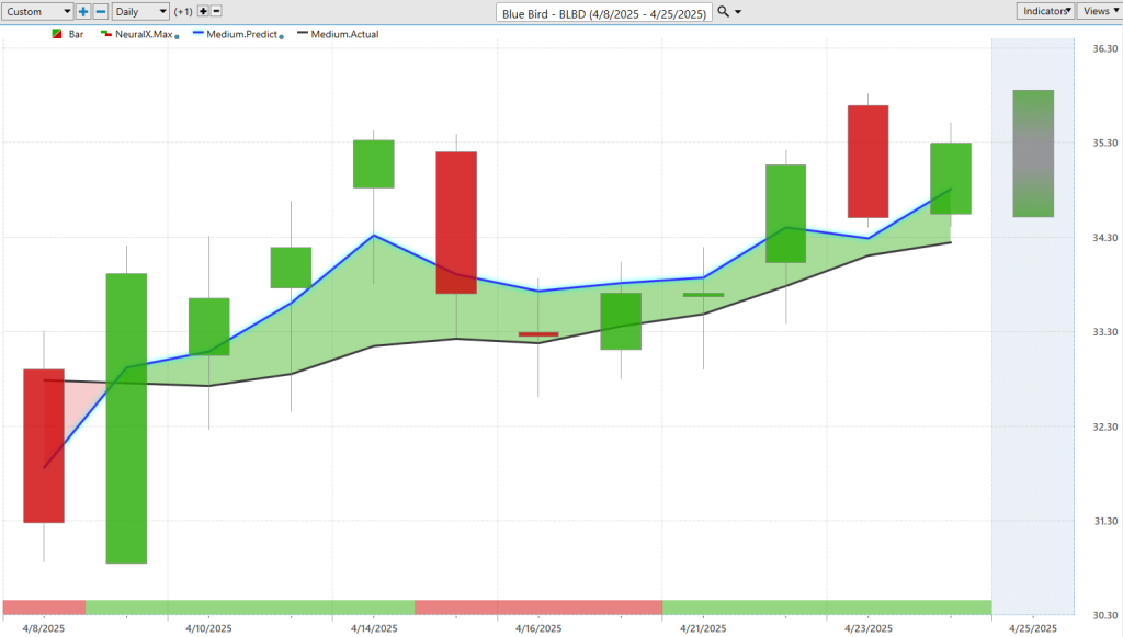
This is a chart in Blue Bird ($BLBD). We’ll go ahead and start here. We looked at this over the past couple of weeks, and it serves as a really nice example during a period like this of how we can walk these forecasts forward and, again, help us make better trading decisions.
What we’re seeing here is daily price action, where each one of these candles is going to represent a full and complete trading day. The first thing that should jump out at you is you’ll notice that right up against all that price data, there’s a black line and also a blue line value.
The black line that you see there—that is a simple moving average, or what we refer to as the actual simple moving average. In this case, it’s a 10-period, so it would look at the previous 10 closes, add them all together, and then divide by that number. That acts as a baseline for the VantagePoint trader. It lets us know where the market price has been.
But obviously, traders want to know—hey, where are prices headed next?
So, what we’re able to do is compare that black line—what you might call a lagging moving average—to the proprietary VantagePoint predicted moving average. For this number to get calculated and then plotted on the chart every evening for traders, this is where the technology of artificial neural networks comes into play.
They’re performing what we would call intermarket analysis on shares of Blue Bird ($BLBD). What that means is that there are known relationships that will drive and influence the future price of this stock. That could be things like ETFs like the SPY or the Q’s. It could be some of the futures markets. It could be other individual stocks. It could also be things like currencies—currencies drive the broader stock market—interest rates, gold markets, commodity markets. Depending on what you’re trading—maybe a mining stock, maybe a defense contractor—you have this unique set of what we would call intermarkets that go into generating these forecasts.
Specifically for Blue Bird, we’re going to get those updates every single night. What happens is those relationships weigh on the prediction. When we start seeing this blue line cross above the black line, those intermarket relationships are actually skewing this average higher and letting us know that average prices should start to move up. That’s the VantagePoint predicted moving average.
We can see, since the point of the crossover—which again is some of this market noise driven by tariffs and just a lot of day-to-day news—there’s been about a 6% to 7% rally in just the last 10 trading days.
In addition to that predicted moving average, you’re also provided a couple of other indicators to help different traders of different time frames solve different problems. At the very bottom of the chart, you’ll see this bar that goes from green to red and back to green. This is also utilizing the technology of artificial neural networks, but it’s tuned to solve a different problem: just over the next 48 hours. You can think of it as a couple of trading days. That warns the trader of short-term strength or weakness. When we combine that with the overall trend, we get an overall expectation of the forecast.
Of course, last but not least, we always end on our predicted highs and lows. You’re even given an intraday predicted high and predicted low range that’s going to help the trader manage their opportunities—whether that’s entries, profit targets, whatever fits your overall strategy.
So, you see here that since that bullish crossover came through, notice how effective these predicted highs and lows are for the VantagePoint trader. You’ll even see things like this where you get a gap-up day—look at that, moving right up to the previous predicted high level on the chart and then pulling back from there. We get the neural index bearish, a couple of days of weakness, but really since the last week—since we brought this market through—what has happened? We moved down to the daily predicted low and it has pretty much moved higher ever since.
Really nice opportunity on the bullish side here, but you do want to be quite careful. There are a lot of markets showing high volatility. Some markets are not doing well, and this is where VantagePoint is very helpful. Some markets have done well since we got that news coming off of tariffs.
What you can do is actually use the VantagePoint predicted moving averages to see, “Okay, where are these areas where we’re maintaining above that actual moving average, and the market is actually in an uptrend?” That would make for a much better place to go ahead and do some trading.
So again, a nice example here of how all these tools work together—regardless of short-term or long-term—offering a very robust forecast for the trader.
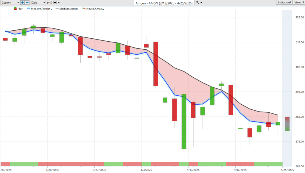
Now here, Amgen ($AMGN). Shares of Amgen, and I wanted to bring this through just to highlight that not everything is going up. But let’s take that information, understand how to interpret these forecasts, and overlay that on this chart.
You see clearly that the predicted moving average is below the actual moving average. That’s been going on for almost a month and a half here in this stock. So clearly, you can only short or take profits on shorts.
Here’s what’s so interesting. As we get that crossover to the downside, notice the neural index is actually bullish. It’s letting you know that, “Look, the trend is down, but expect strength over the subsequent 48-hour periods.” Once that neural index gets bearish, that’s where that momentum starts coming in, and traders can look to exploit that acceleration in the downward move.
Again, you see the neural index gets bullish here—not a very exciting day, tiny little gap-up and nothing much happens—but it’s still warning you to expect strength over the next 48 hours, expect that retracement in the market. But the overall trend is still very bearish.
This is where it’s effective—pretty much the opposite of that previous chart. When we get a downtrend where the neural index is bullish, sure, you might get some strength, but what is the overall trajectory and trend of that market?
Of course, we can again bring in the finer-tuned predicted highs and lows. You see here that the market moves up toward these predicted highs. Obviously, if you’re looking to short or trade a downtrend, you’d want to be looking toward those levels. They offer good entries on the bearish side.
Even after we got this huge up day here from a news announcement, notice this market just sort of languishes—taps up a couple of predicted highs, but never gets into an uptrend. And we see it’s pretty close to its longer-term lows here on the chart.
This is why it’s very important to differentiate. When we got that shift in some of the markets, what markets are doing well? And which markets aren’t creating a crossover and are still in a downtrend? Those are the ones you’d certainly want to avoid for any sort of trading—shorter-term or longer-term position trading.
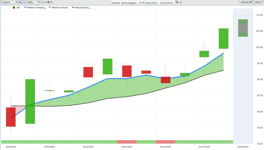
Palantir Technologies ($PLTR). Here’s Palantir. It’s a very popular stock. And back to this point of, “Okay, which stocks have actually moved up into an uptrend?” That’s where our focus should go.
To keep things fairly simple here—you’ll notice the neural index goes bearish. What happens? You get subsequent weakness in the price action, but never even close to a crossover to the downside. That’s what lets you know, “Look, all you’d want to do here is go long, take profits on long positions,” and potentially use that to get some good entries on longer-term position trading.
Of course, the predicted highs and lows can be of service here too. As we get this move, you see we gap up and get a lot of volatility—moving outside the range but settling in toward these predicted lows, and then that resumption of the uptrend.
We see the confluence of the overall trend, the neural index, the predicted high and low ranges all slanted higher. And sure enough, that’s where we see this market break out to the upside.
We can see the overall move here—about 20%, over 20% in the last 10 trading days. Just over the last week, up almost 20%, 15% to 20% in just the past few trading days.
So really exciting moves, but it’s very important that traders identify the differences between Blue Bird, Palantir, and then things like Amgen.
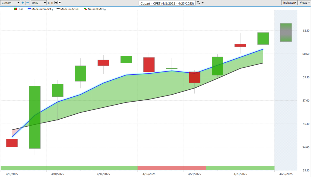
Copart ($CPRT). Here’s Copart. Again, another example. There’s a lot of correlation currently in the markets, and so—blue line crossing over black line, a lot of separation between that predicted moving average and the actual moving average.
This is a car auction company, so there are a lot of repos happening in cars. Potentially, this market can actually do pretty well. You see that market price is moving down toward these predicted lows, offering nice levels for the trader to get involved.
Even after the initial movement to the upside, beautiful move down to that predicted low, and the market never even returned to that level. Really nice move here in shares of Copart.
We can again take a look at the overall move from where those predicted lows were—and you’re up about 8% in just the past 10 trading days, in a very tricky market where we’ve seen a lot of volatility.
There are some nuances here. Everything’s not just going straight up or straight down.
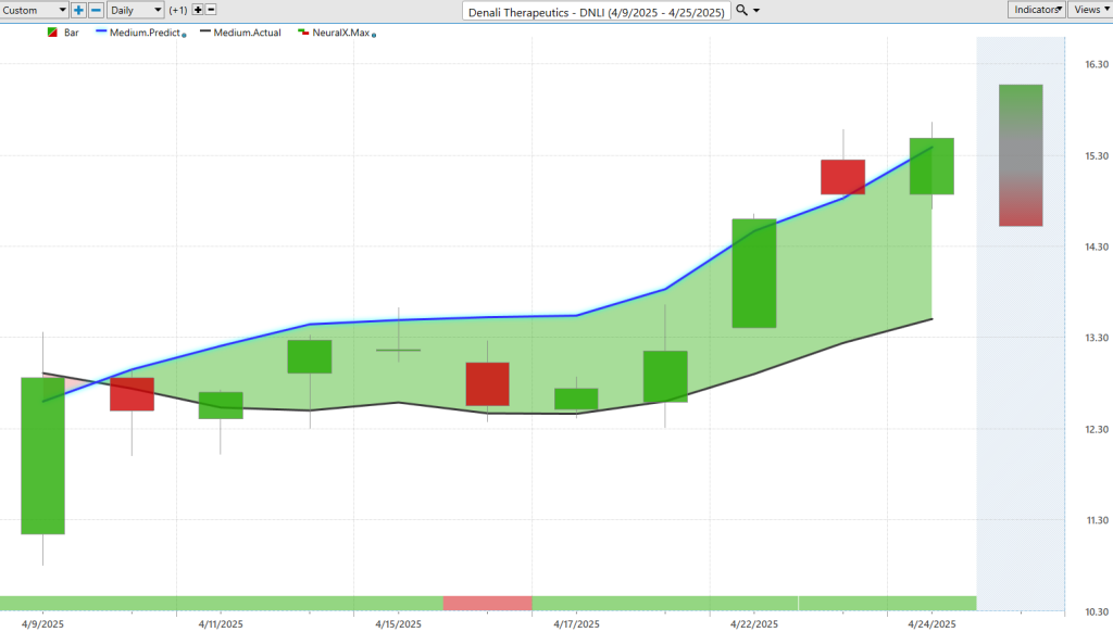
Denali Therapeutics ($DNLI). Here’s Denali Therapeutics, a biotech stock. Blue line over the black line. Neural index bullish.
Even when you get a neural index bearish signal, you actually see some sort of gap downs. The market doesn’t really move for a couple of days before it’s ready to break out.
Look at the predicted moving average here—signaling a lot of separation between the prediction of the moving average and where the actual moving average is. And this is what I’m really getting to: paying attention to the separation between those VantagePoint predicted moving averages and the actual moving average can serve as a signal in and of itself.
It helps identify, “Hey, where are the stronger markets?”
If we just think about the S&P 500 itself—you’ve got 500 options, potentially, on where to put a trade on for that week. Of course, you want to find the most bullish option where all of these indicators and tools are in confirmation.
Molson Coors Brewing Company ($TAP)
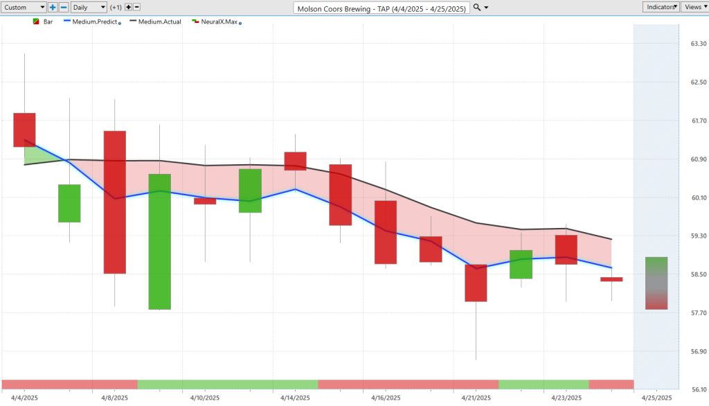
Now here’s Molson Coors Brewing ($TAP). Again, just a great example of how all the tools work together. Sometimes we get these really strong moves higher. Sometimes we get big collapses that happen in very short periods of time. But sometimes the market just runs sideways.
That doesn’t suggest that there’s not money to be made or trading to be done, but you need the right tools to get the most out of that opportunity—especially if the market’s not moving a lot.
You see here, this market’s just sort of crept down from 60 to about 58. But let’s look at how accurate all of the predictions are—these daily predicted high and low levels.
You see them offering up these levels to say, “Look, if you want to short or take profits on shorts, that would make the most sense.” You get accustomed to seeing these kinds of days, where all the price action is bearish for the day—never trading higher—and then what happens? The next day it just goes up to that previous predicted high level, which should already be on your radar as a potential for where that market’s likely to trade.
Then, of course, the uptrend happens. You start moving down toward these predicted lows once again.
So again, a really great example of some nice trading opportunities—but also just letting you know, “Hey, what areas should I avoid? What areas have actually pivoted to the upside?”
When we look at Blue Bird, Palantir, Denali, Copart, you see very similar charts. And that’s the point. VantagePoint is exceptional at picking up on those correlations—understanding that, “Hey, if this stock’s moving up, that adds more bullishness to this other stock.”
Some of those may be inverse correlations. Some may be leading or lagging relationships. This is where the software does an excellent job compared to what a human would be able to visually identify with all of these important price clues happening in the marketplace.
We’ll go ahead and leave it there for the Hot Stocks Outlook for April 25th, 2025.
Thank you all for watching. Best of luck, and bye for now.